Conclusion of the In-Game Menu Rework (Inventory, Stats and Settings)
Welcome to the latest devlog, continuing the exciting journey from our last update. First off, we've improved the inventory screen even further – now, when you hover over an item, its value and description are shown to the player!
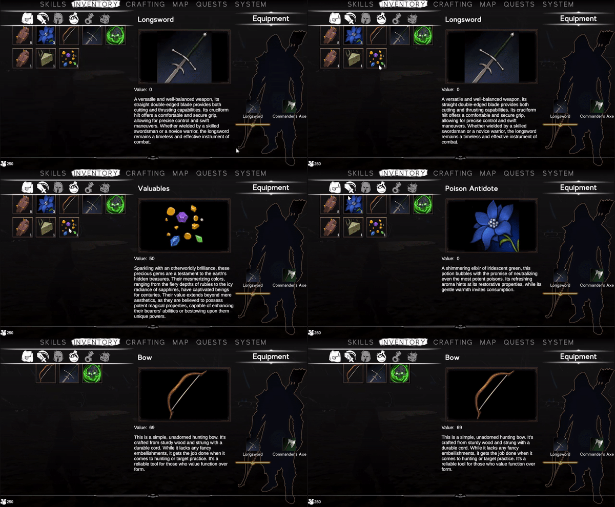
The inventory showcases the new hover effect.
Now some new content! During the rework, we found that the old stat menu was looking a bit lacklustre, so we've combined the two for a more streamlined experience. The skill menu, still in the planning stages, promises to introduce new passives and spells to enhance your casting and other traits. Check out the transformation below:
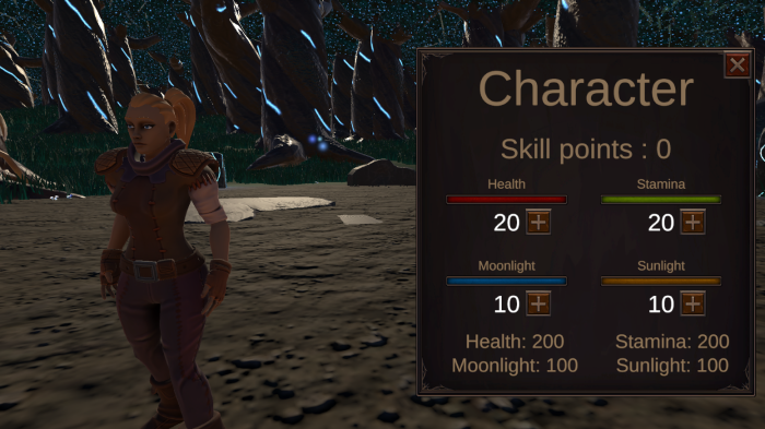
The old stat menu.
Much like other menus, it fails to appeal with its oversized buttons, massive text, and outdated art style. Below you can view a much cleaner redesign.

The skill menu redesign.
Notice the small arrow and the 0 at the bottom right? That's your display for skill points. Gain one each time you level up, and you can spend them on the exciting skills we're cooking up for you. Plus, we've cleaned up the level-up buttons – they only make an appearance when you've earned that level. Take a peek at the refined stat menu when you're ready to level up:
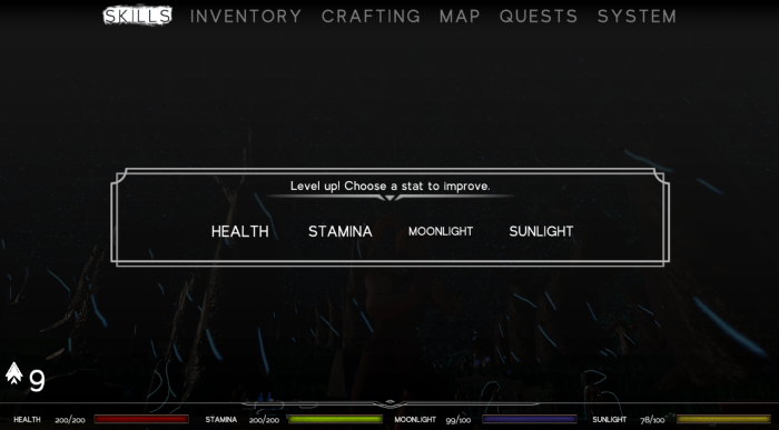
The skill menu redesign with level-up choice.
Once you've made your skill selection, the menu disappears. Now, let's talk about the settings menu – it takes quite a bit after the settings menu you saw in our main menu post, but now styles to blend with the other in-game menus.
And for the grand finale of this devlog, we've given attention to a smaller UI element that was patiently awaiting its turn for a makeover, the tiny level-up notification, it also has very cool sound effect, but you'll have to play the game if you want to hear that!
And for the grand finale of this devlog, we've given attention to a smaller UI element that was patiently awaiting its turn for a makeover. The tiny level-up notification, complete with a very cool sound effect, but you'll have to play the game if you want to hear that!
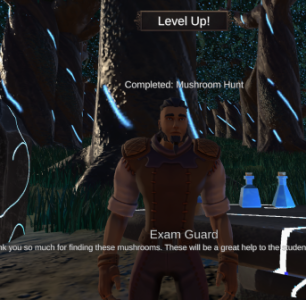
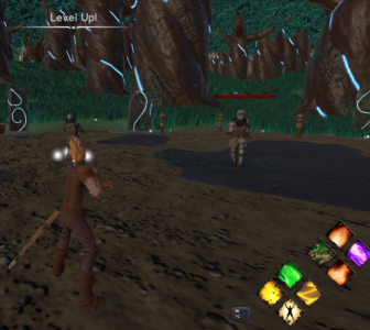
The new and old level-up screen.
Thank you for joining us on this week's devlog! It's been a delightful journey of redesign, and with these updates in place, we're ready to dive into crafting the remaining menus you've glimpsed at the top. Many of them were on hold due to the old UI's limitations, but fear not – new content is on the horizon with our future updates! Don't forget to give a like if you made it this far, we do value them!
Get Tenril
Tenril
Put an end to the conflict of the two races of Tenril.
| Status | Canceled |
| Publisher | |
| Authors | HeavensGates, JacquesAV, LapizLazuli, Tessa |
| Genre | Role Playing, Action, Adventure |
| Tags | 3D, Atmospheric, Fantasy, Singleplayer, Story Rich, Third Person, Unity |
| Languages | English |
More posts
- The end of a journeyMay 23, 2025
- Xipilian Social CeremoniesMar 02, 2024
- Skill Tree: Swapping spells, Pyromancy tree path and much more!Feb 17, 2024
- Forging Your Destiny - Crafting System Part 3Feb 10, 2024
- Forging Your Destiny - Crafting System Part 2.5Feb 04, 2024
- Lunaegan Social CeremoniesJan 20, 2024
- Skill tree: Menu creation and Biomancy pathJan 06, 2024
- Forging Your Destiny - Crafting System Part 2Dec 23, 2023
- Social Structure; Xipilian CityDec 09, 2023

Comments
Log in with itch.io to leave a comment.
The uploaded version is 1 year old. When are you going to update it?
Ah yeah, we posted a while ago that updates would slow down for quality control. It was originally about 2 weeks per update but we decided to hold on updates until a new major update. We set some goals in a roadmap for what we wanted to implement before the big update and were knocking down targets at a steady pace.
I searched for it real quick and ill list what there is and strikethrough the completed parts:
Creation of game logomain characterand 2 important npcsChanging over to a better render pipelineHarvesting resourcesChest lootingWe've been doing a lot of overhaul as well so I'd be hopeful and say maybe 6 more months for the update but realistically this is probably gonna take longer.
Congrats on finishing your ui rework!
Thanks!