
Tenril
In-Game Menu Rework (Main Screen and Inventory)
Welcome to the next phase of our UI Reworks in Tenril. In our previous post, we focused on revamping the in-game UI, and now we're looking into the overhaul of our in-game menu interface. If you've played before, you might recall the menu used to look like this:
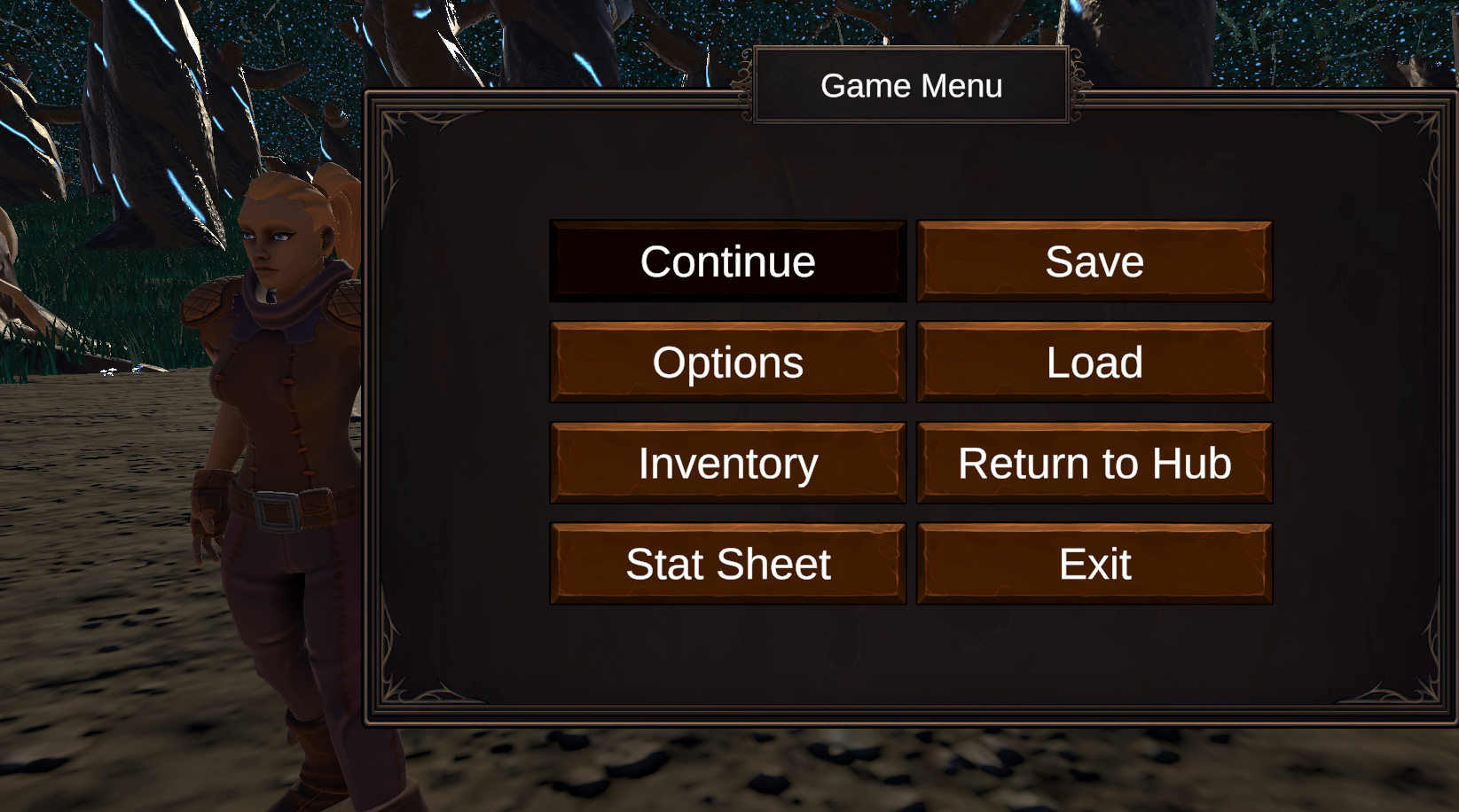
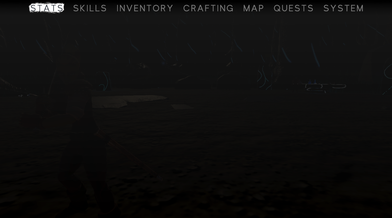
Originally, this menu was created as a quick and dirty way to access various game features without the need to memorize hotkeys. However, it's safe to say it was the ugliest menu in our game. Our latest update addresses this issue by introducing a tab bar, allowing you to switch between menu sections, as showcased below:
This new design is much cleaner and pleasing to look at. But now we're moving on to the bigger change for this devlog. If you have been following the development of our game, you've likely encountered our inventory menu, which used to look like this:

While this inventory menu had seen some improvements over time, it still fell short of our standards. That's why we've gone back and completely overhauled and refined the entire layout:
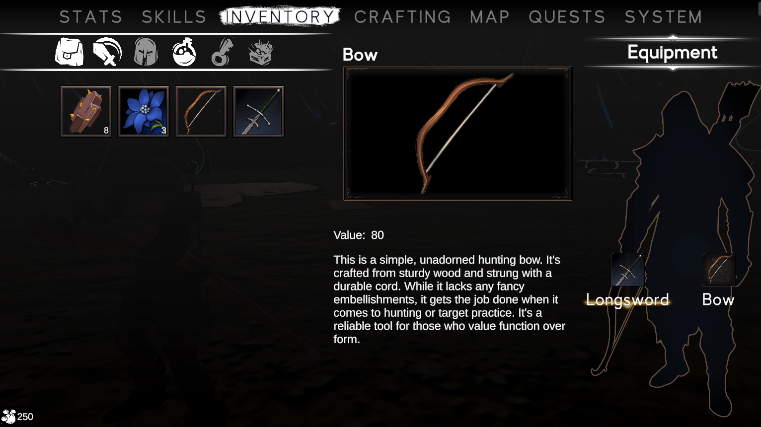
Functionally, the new inventory screen remains familiar, but it now provides detailed information about the selected item. This change allows players to be more informed about the items they find, ultimately improving their experience.
The journey of UI improvements in Tenril is far from over. As you can see from the tabs at the top of the new menu, we still have several more menus to remake. Please note that Crafting, Maps, Quests, and Skills are yet to be implemented, and we're excited to tackle these in the near future. In the immediate pipeline, our focus will be on revamping the Stats screen.
Stay tuned for the next UI update, and thank you for your continued support as we strive to enhance your Tenril experience!
Leave a comment
Log in with itch.io to leave a comment.